Please enter the password to continue.
Would you like to see the case studies? Please get in touch for access.
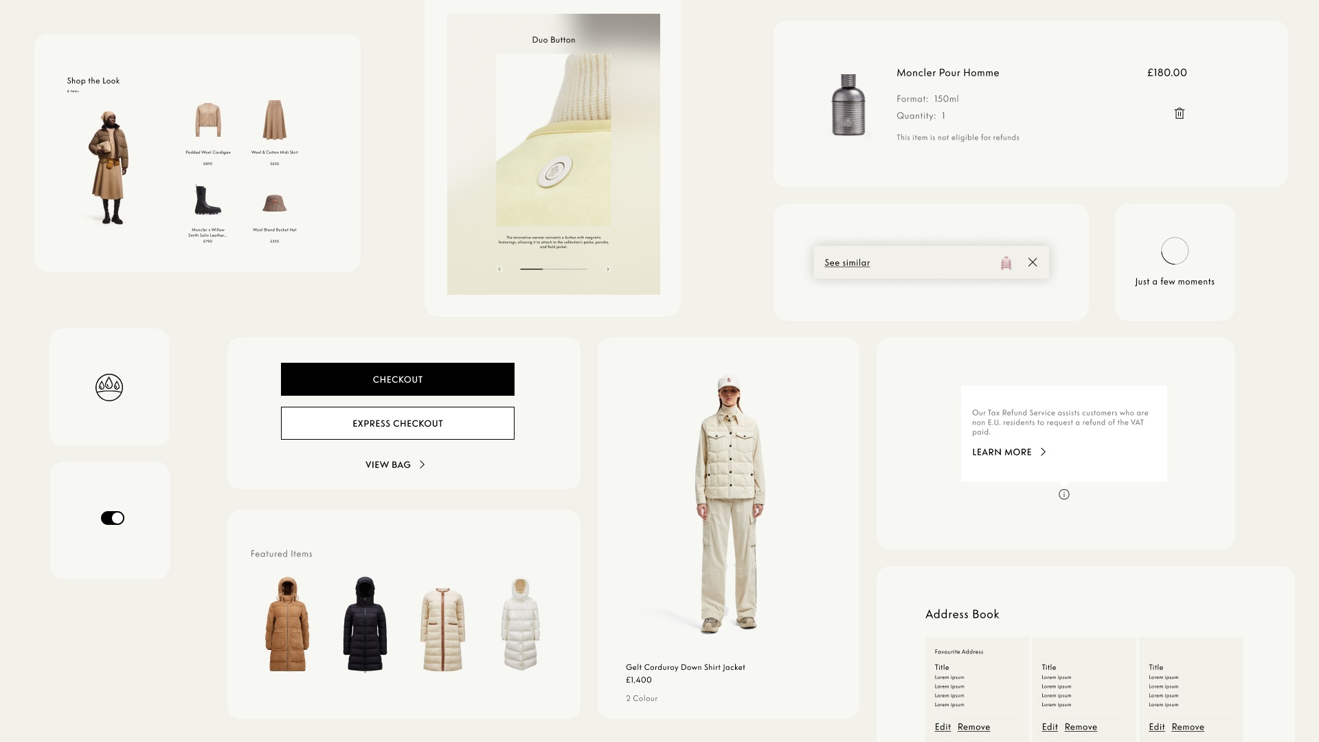
Moncler's digital experience spanned web, app and international markets, but every screen was built in isolation. Patterns weren't shared and components couldn't scale. Build one shared foundation: the single source of truth for design and development.
A collaborative ecosystem built on Atomic Design (atoms, molecules, modules, templates) connecting teams, tools and practices, designed in Figma and documented in Zeroheight.
Empower 10+ teams to design and ship as one: faster decisions, consistent quality and the same brand excellence across every touchpoint.
Moncler's digital experience had grown fast across web, app and international markets, each surface carrying its own patterns and components. Nothing was truly shared, so teams re-solved the same problems in parallel and quality drifted from one screen to the next.
Scaling the experience meant building one place where design and development could work from the same truth. Not more components, but a shared foundation everyone could rely on.
A set of elements that become standards. They can be used at scale, using components and patterns. It brings together principles, rules, components, styles and guidelines in a unified central place, ensuring coherence, efficiency and scalability across all touchpoints.
The Design System is a collaborative ecosystem built to become the single source of truth for the design and development of every digital product. It rests on four pillars:
It empowers everyone involved in creating our digital products to work with clarity and consistency, speeding up decisions while ensuring every experience reflects the same level of quality and brand excellence across all platforms. In practice, the system drives three things:
The Design System has been developed based on Atomic Design principles. This method helps design interfaces by breaking them down into smaller building blocks, inspired by chemistry processes.
The Design System doesn't belong to design alone. It's the common language of the entire digital organization, from commerce to content, marketing to engineering. Everyone builds on the same foundation.
Figma is where we design, build and maintain the system: real-time collaboration, scalable components shared across projects, and high-fidelity prototypes to validate interactions before implementation. Zeroheight hosts the documentation, an accessible hub for components, patterns and usage guidelines.
 Step 01 · DesignFigmaComponents, variants and prototypes are built and maintained here.
 Step 02 · DocumentZeroheightThe library is published as guidelines the whole organization can read.
The real test of a system is whether people reach for it. Documented and governed, and reinforced through design reviews and shared rituals, it turned recurring debates into a single reference. Questions that used to bounce between teams now have one answer:
A design system isn't a library. It's an agreement.
Once the decisions lived in one place, a large organization could move as one. Fewer debates, fewer inconsistencies in development, and the craft free to go where it matters: into the experience, not the process.